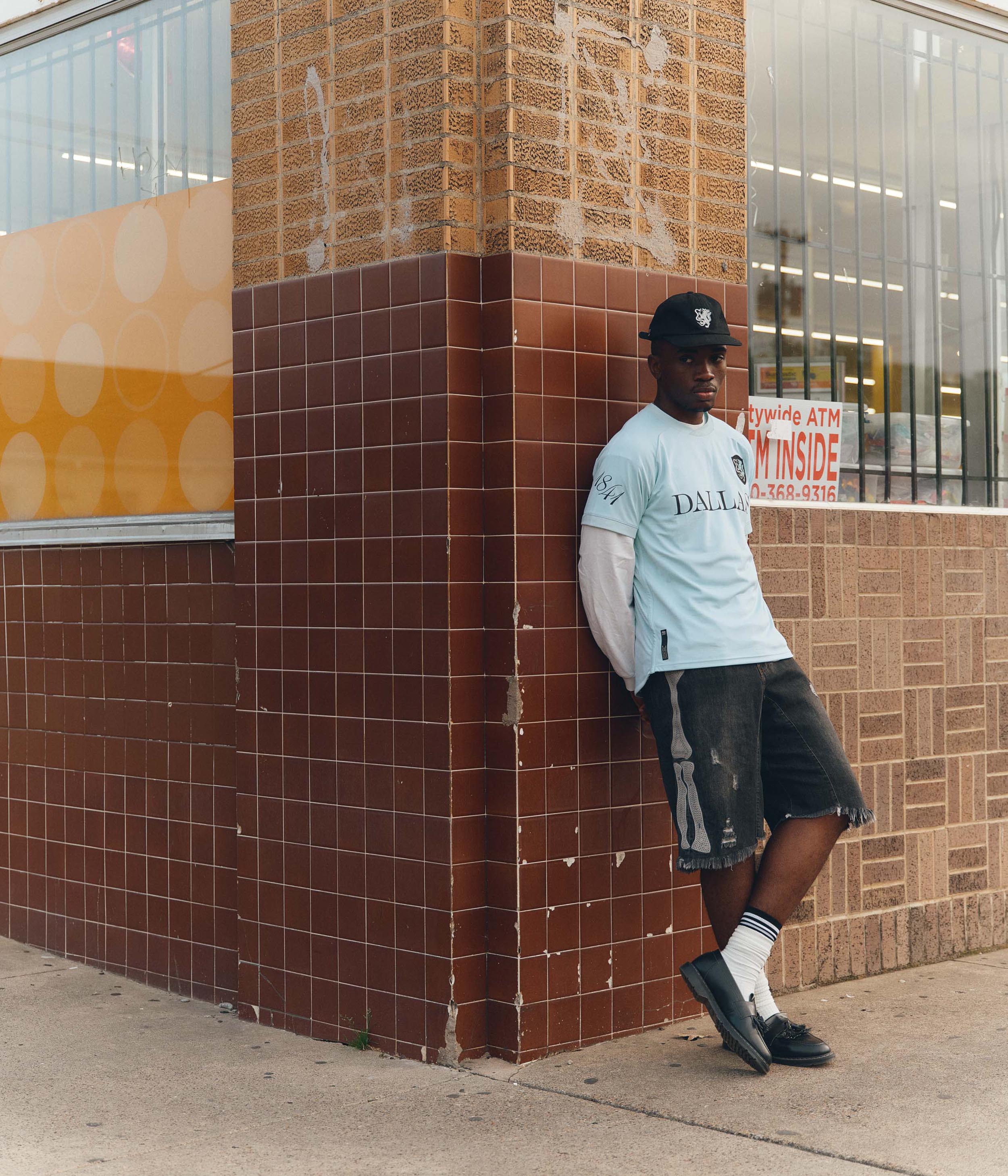
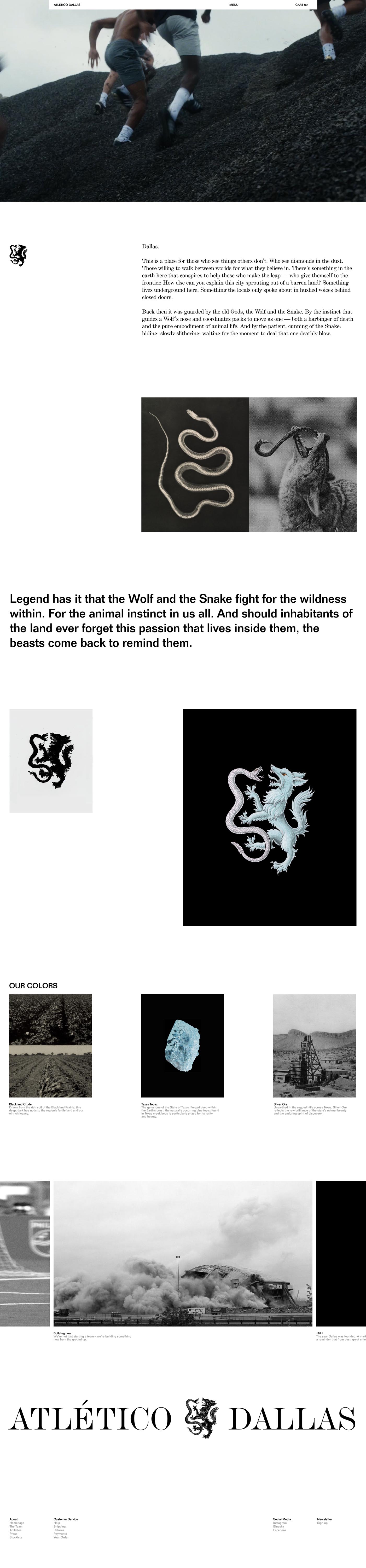
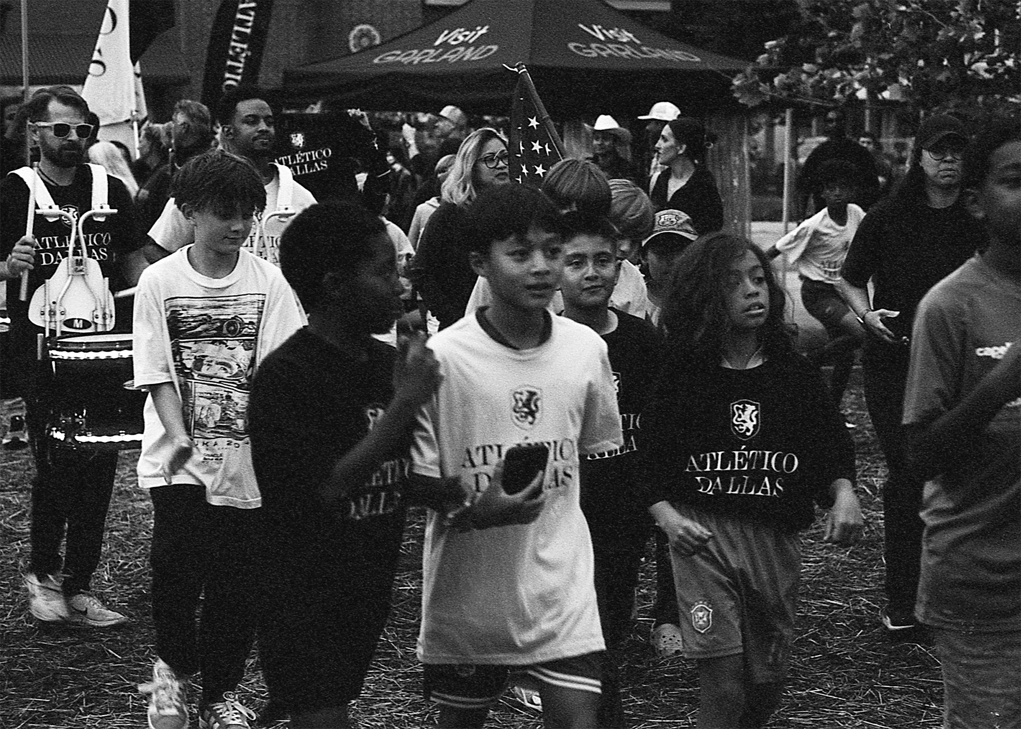
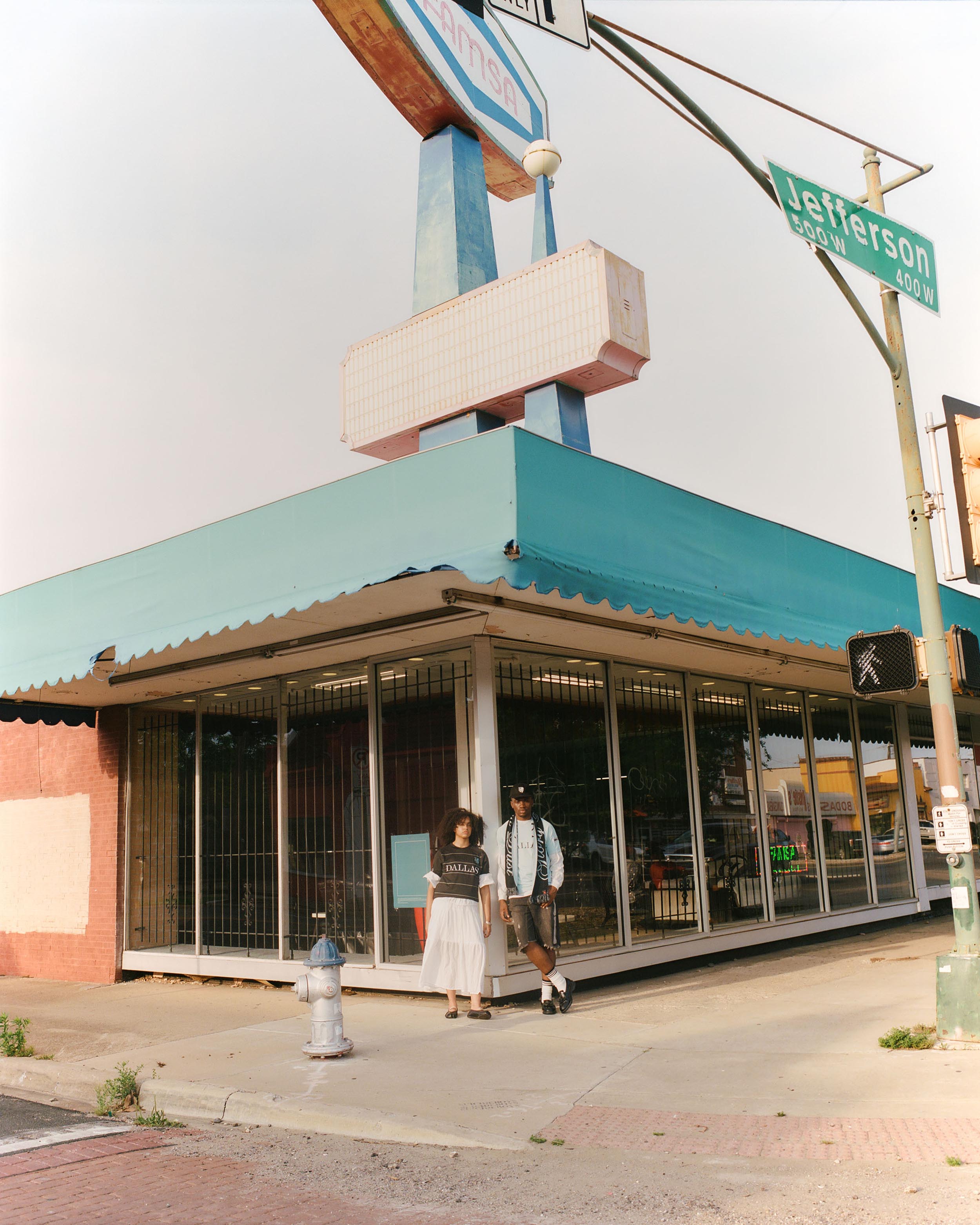
Kicking off in 2027, Atlético Dallas joins the growing USL Championship—a new club built to unite soccer fans in the heart of Dallas. Founded on the belief that greatness rises from the pitches where true passion for the game lives, Atlético was created to represent the city’s next great chapter in football.
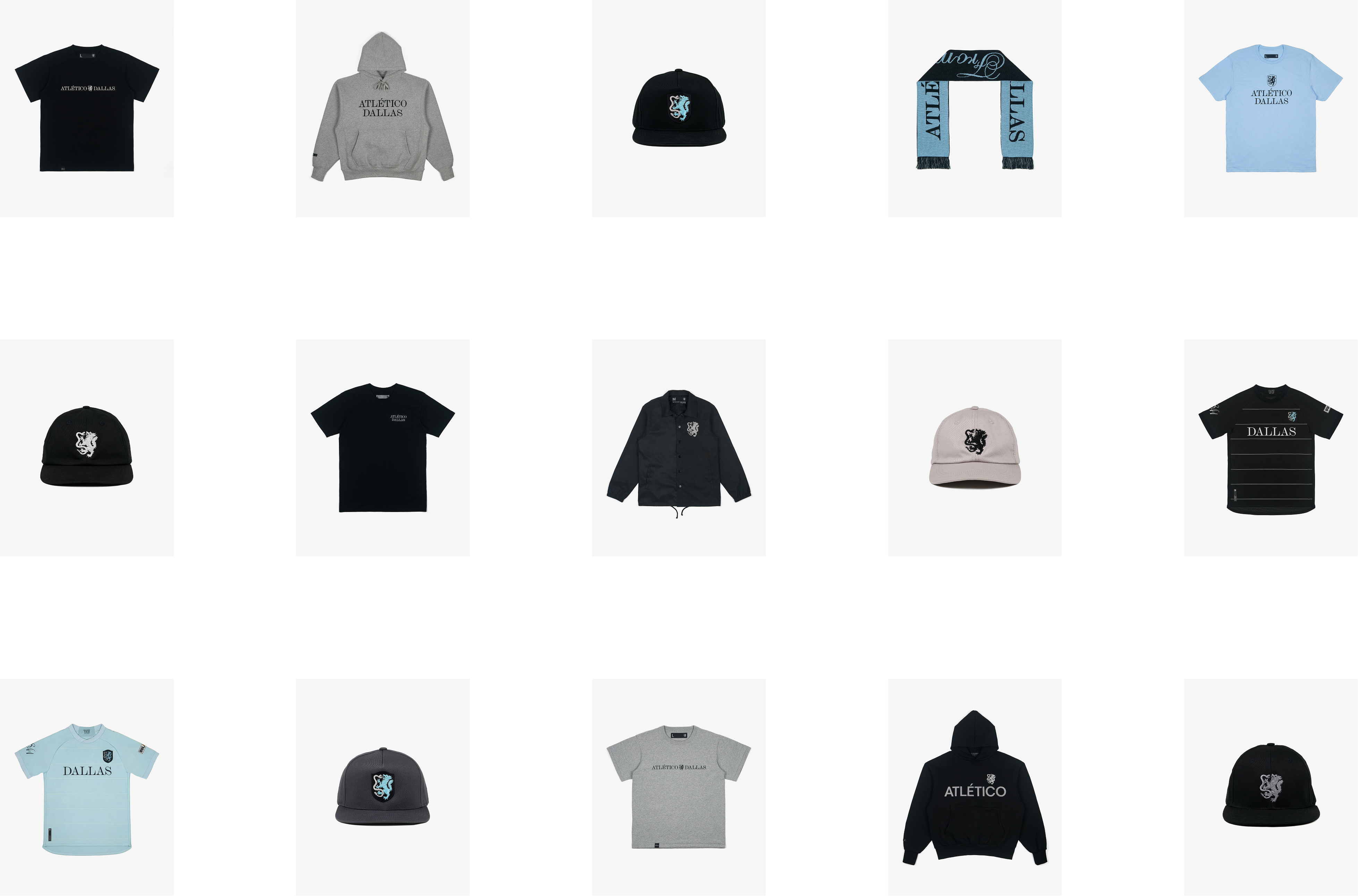
In collaboration with Moniker, we developed a brand identity that would define a new era of soccer in Dallas—one built on tradition, craft, and resilience.


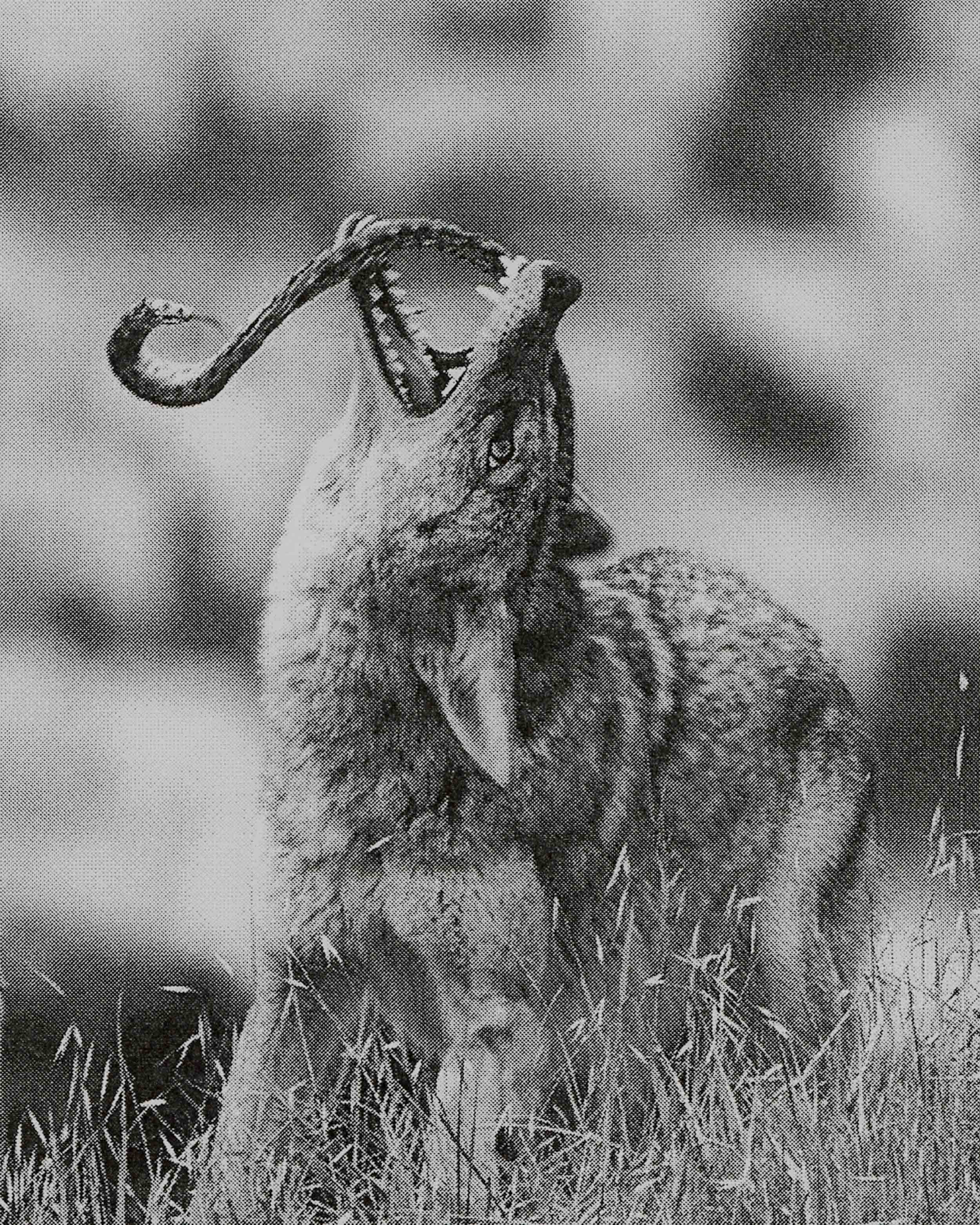
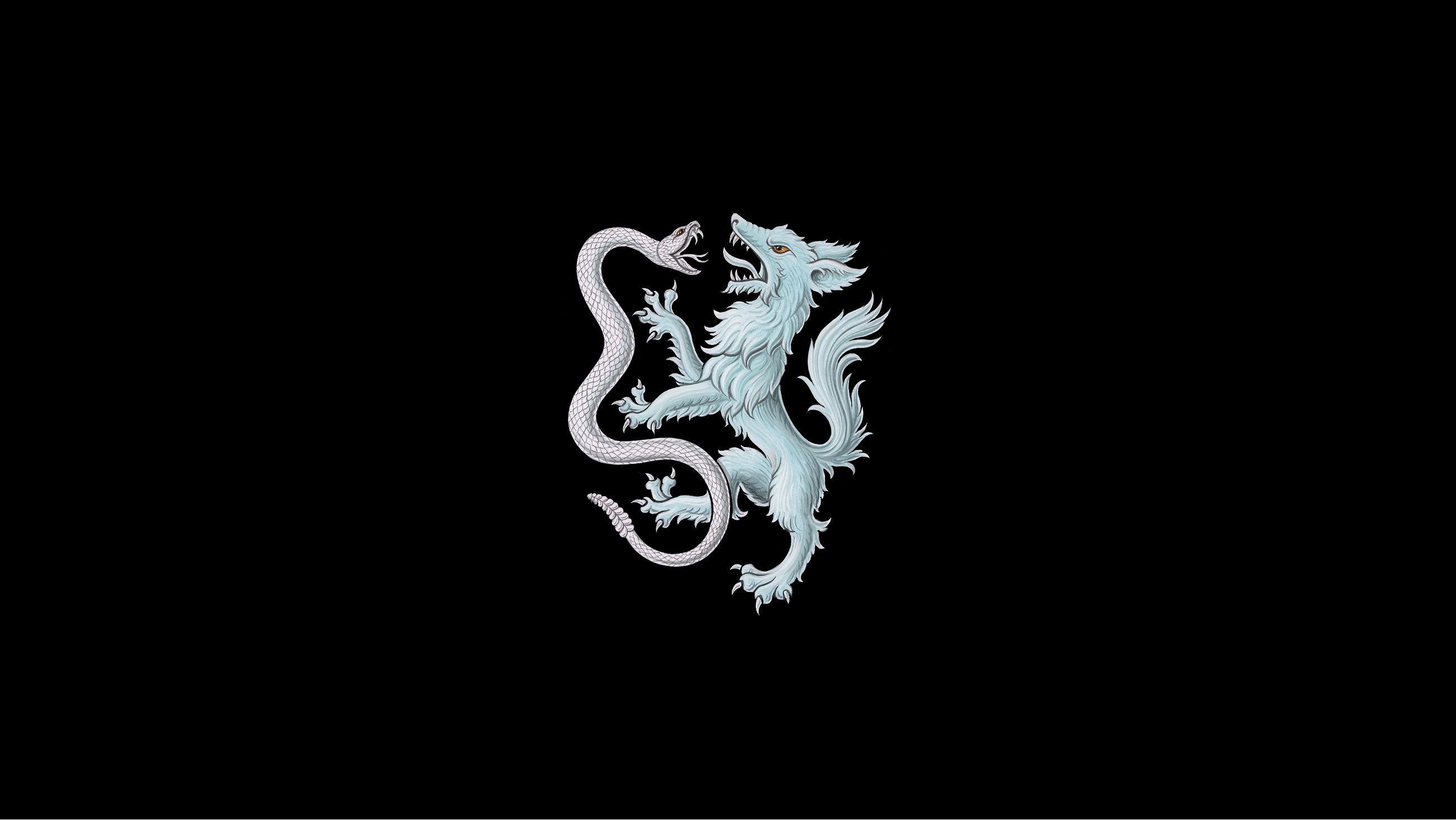
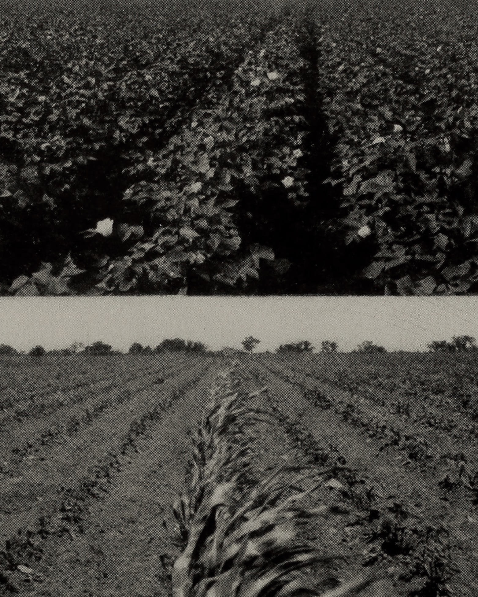
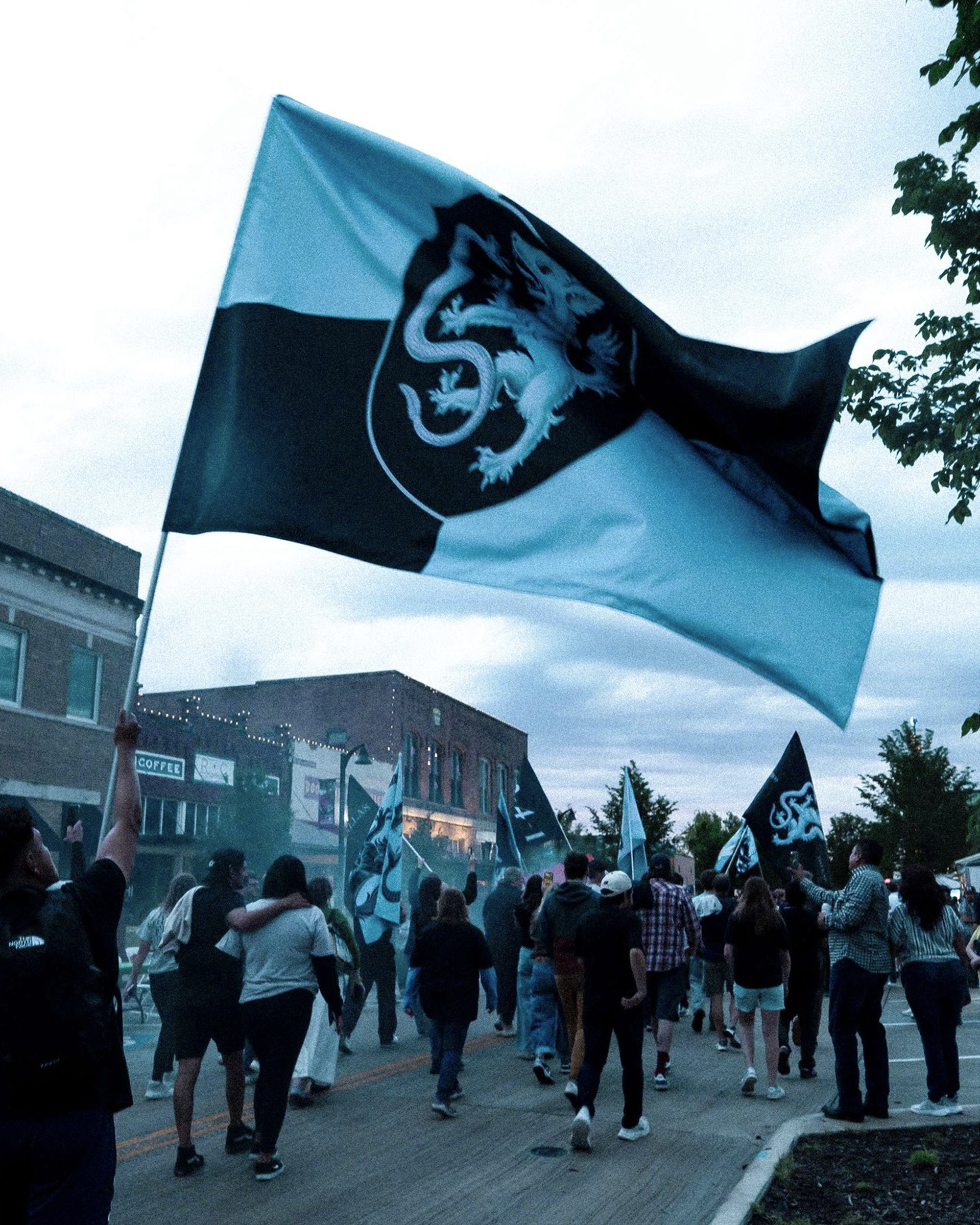
Our research into the birth of Dallas led us back beyond 1841, to a time before settlers arrived, when the land was guarded by the beasts that roamed it and cared for by the tribes who lived in balance with the prairie. Inspired by this harmony and tension, we imagined the ancient legend of the Wolf and Snake.
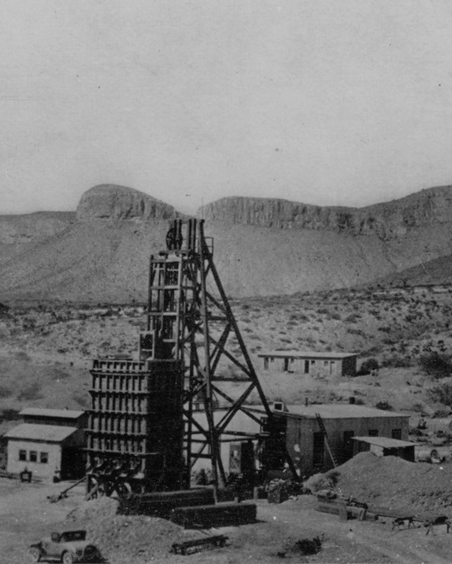
Until ranchers killed the last one in the 1940s, the Wolf had long reined as the apex predator of North Texas—commanding the prairies through presence and power. The Rattlesnake was his rival: stealthy, patient, and deadly when provoked. Their struggle was eternal—a contest of equals who understood that respect is earned in the fight.
Together, they embody the enduring spirit of Texas: prideful, resilient, and unwilling to yield. That legend became the foundation of the Atlético Dallas identity—an emblem of strength, balance, and the wildness that still lives within us.
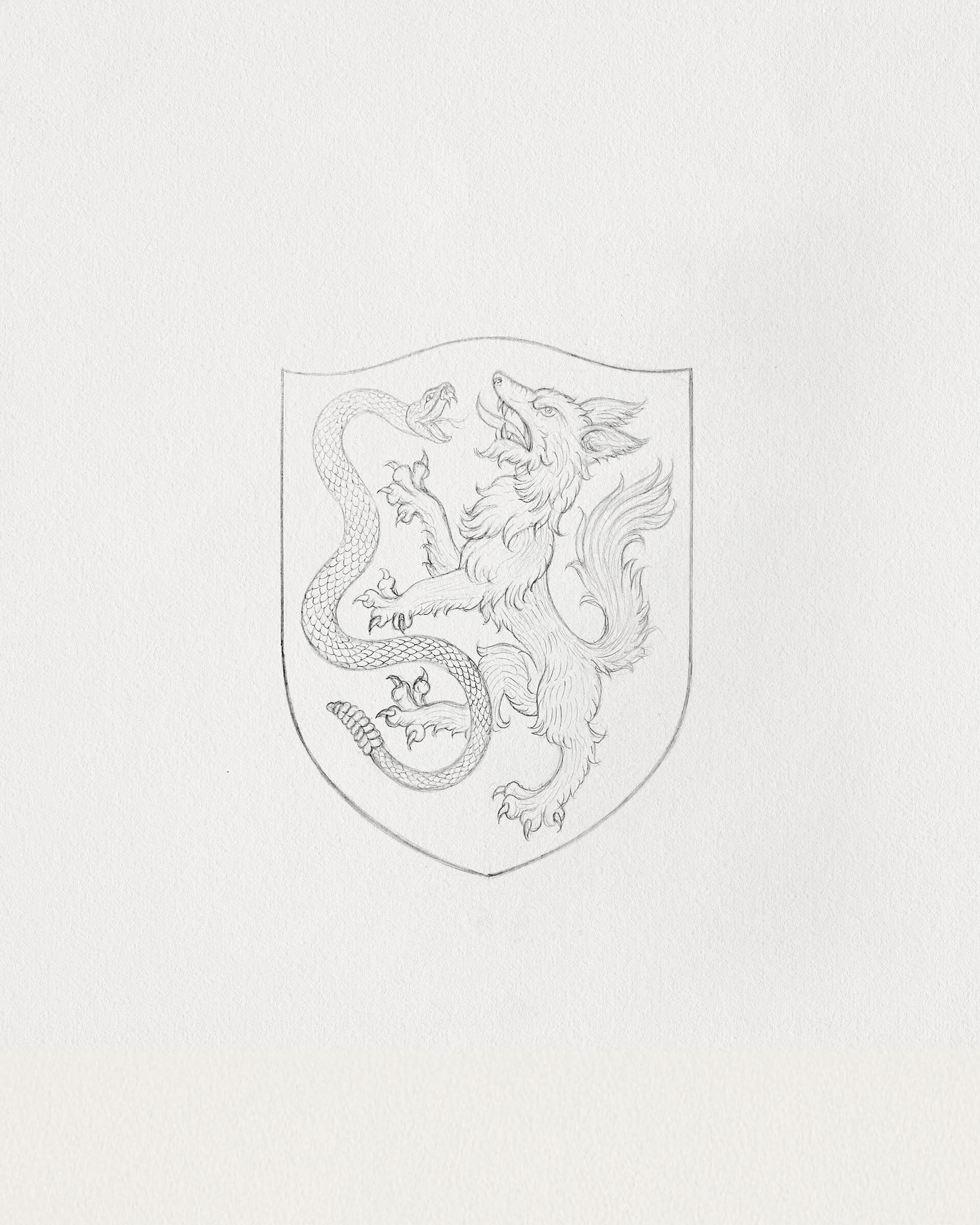
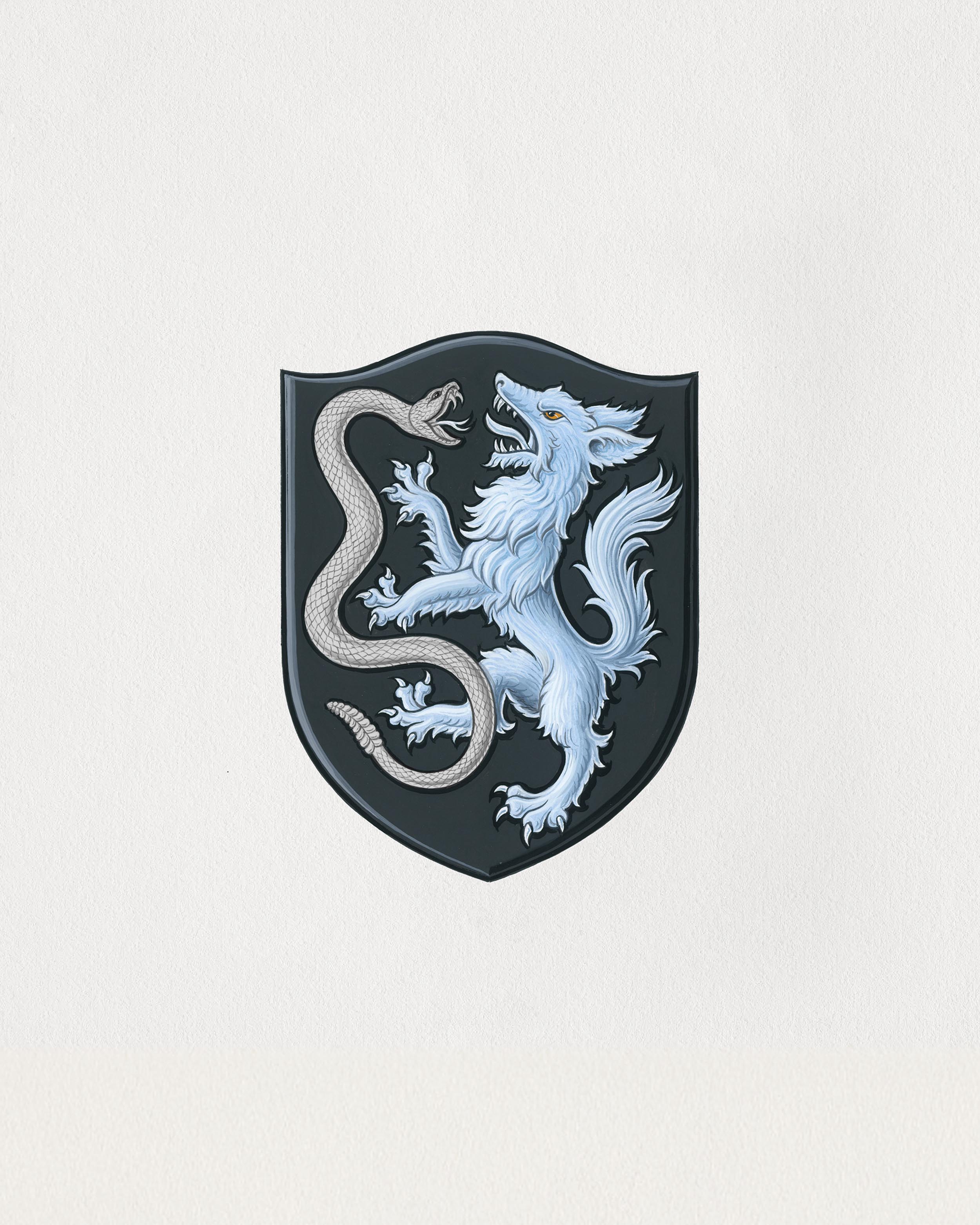
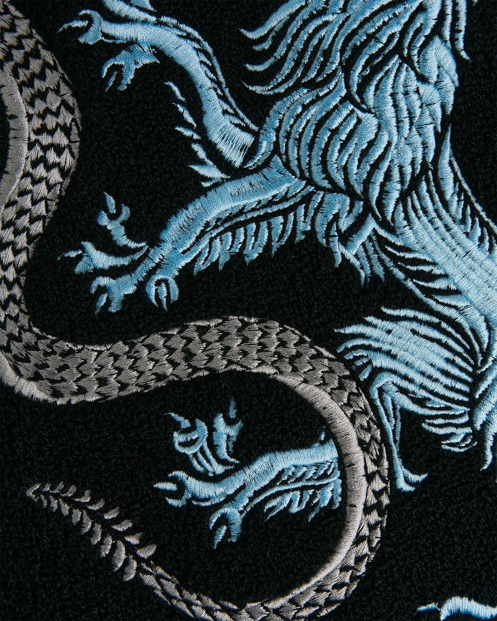
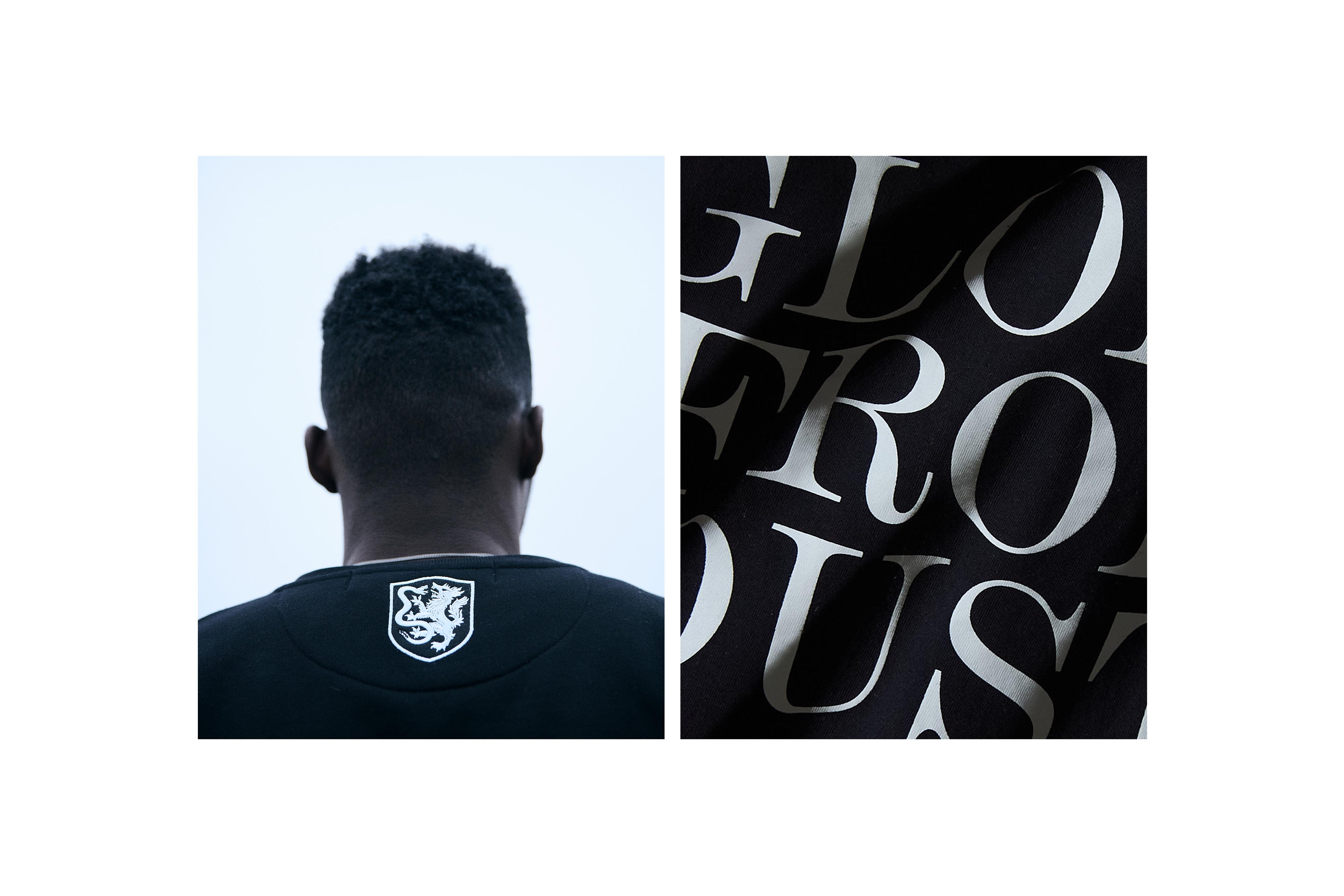
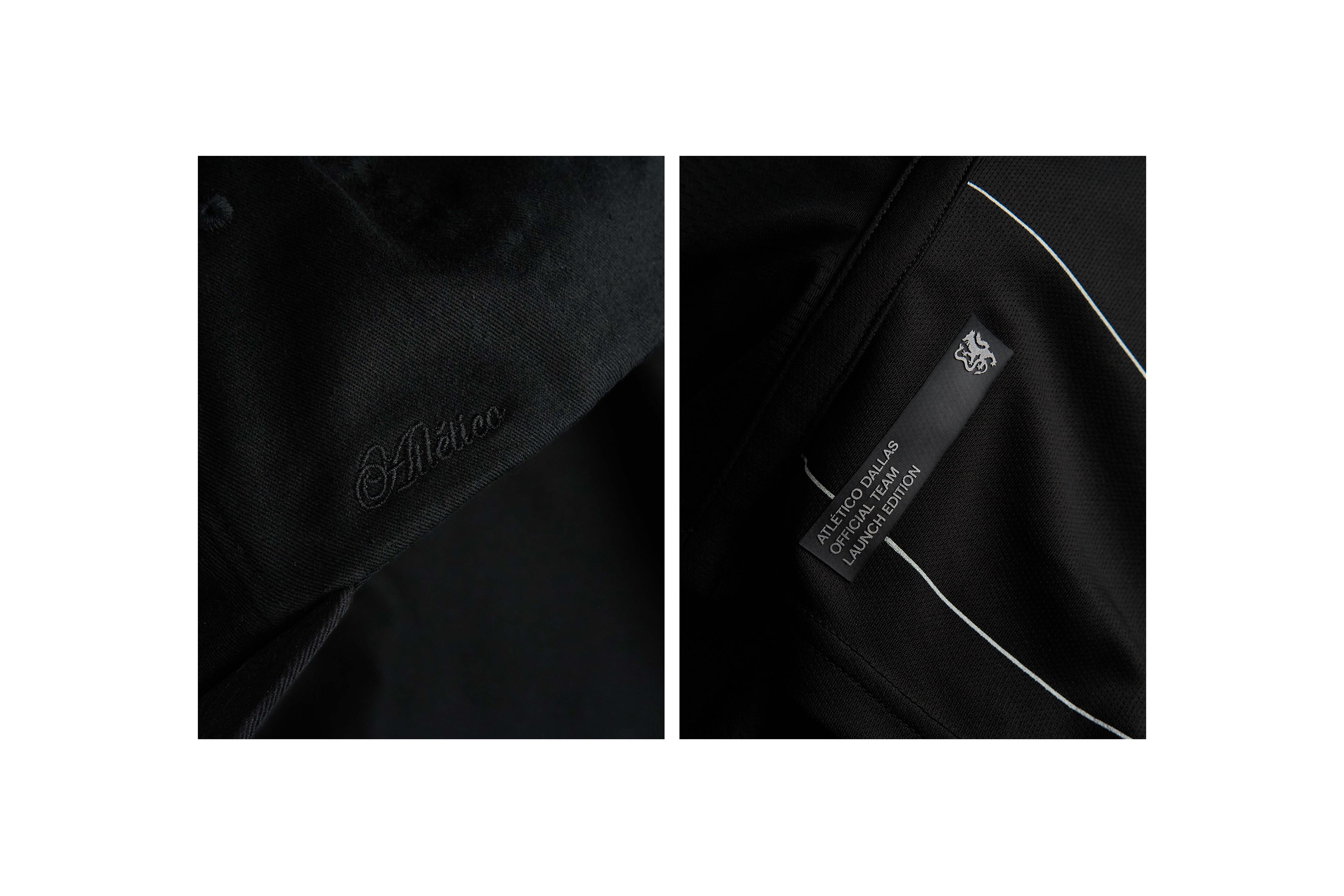
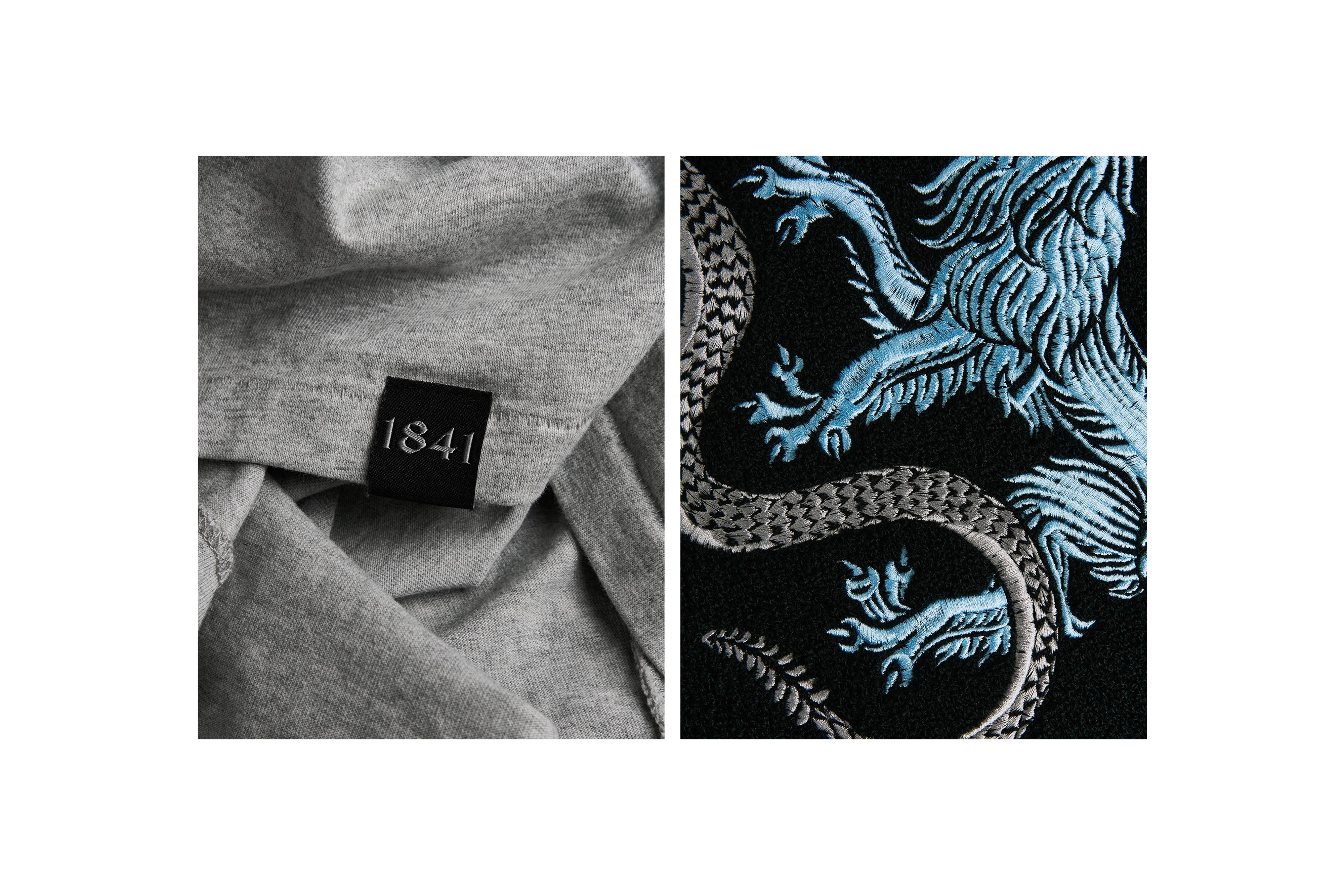
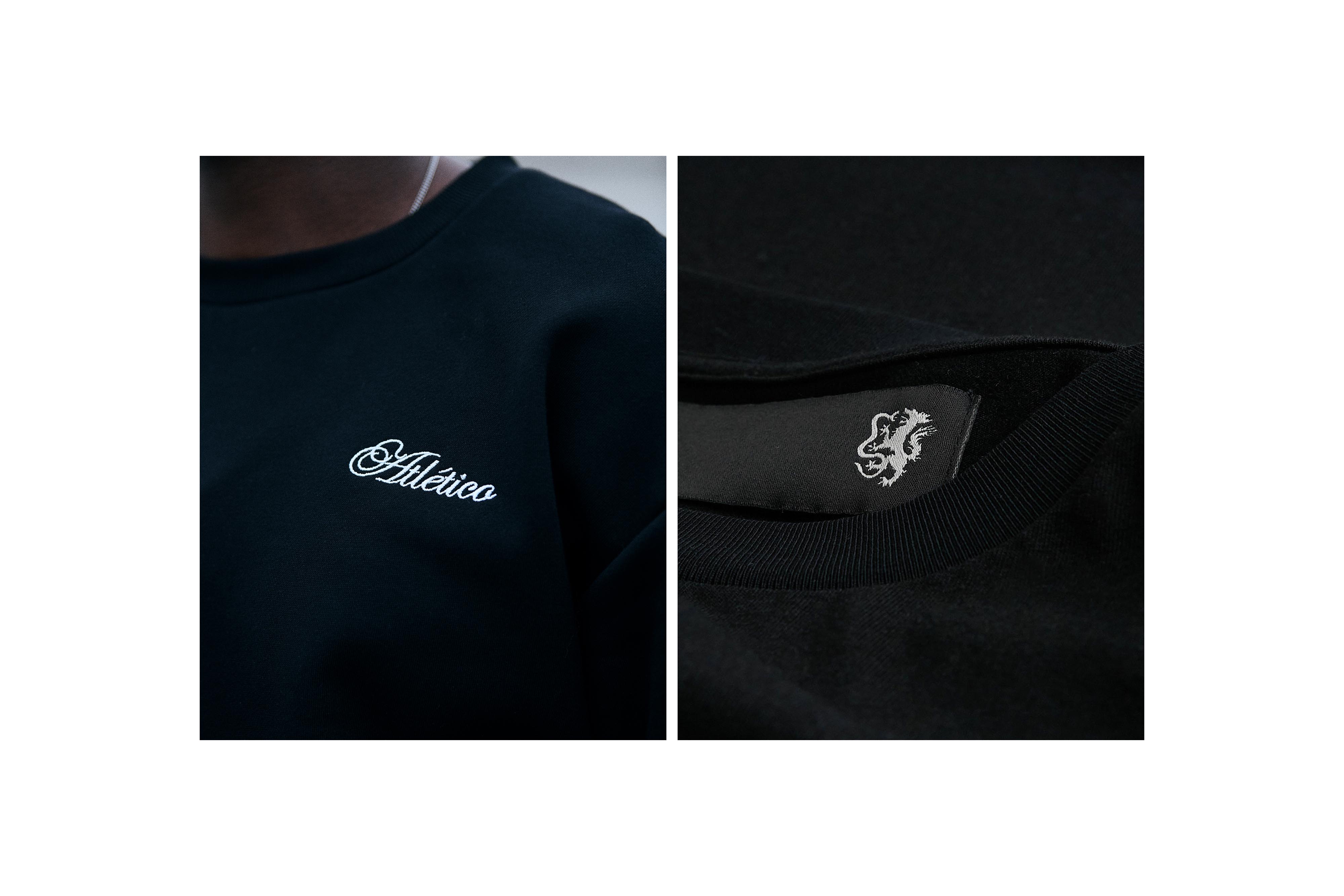
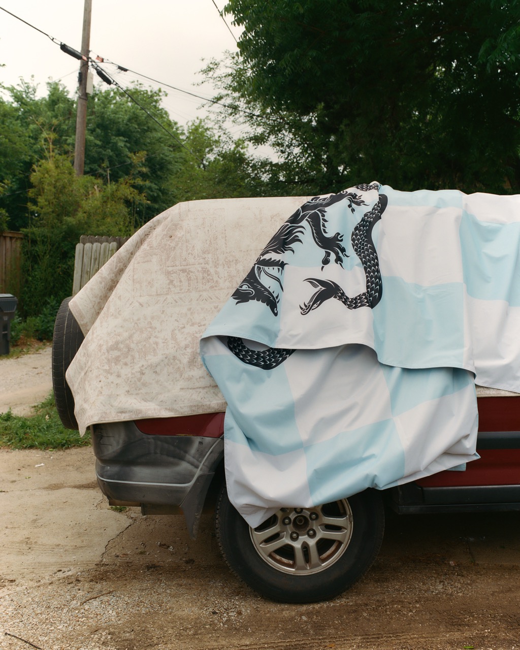
At the heart of the brand is the club’s crest—the Wolf and Snake locked in battle. Painted by traditional artist Tom Meek, the art draws subtle influence from Mexican heraldic traditions, where animals and myth serve as enduring symbols of identity and pride. The crest rejects the slick, hyper-polished style common in modern sports design, embracing detail, imperfection, and humanity. The result is timeless: a crest that reflects the club’s conviction that true identity is earned through meaning, not decoration.


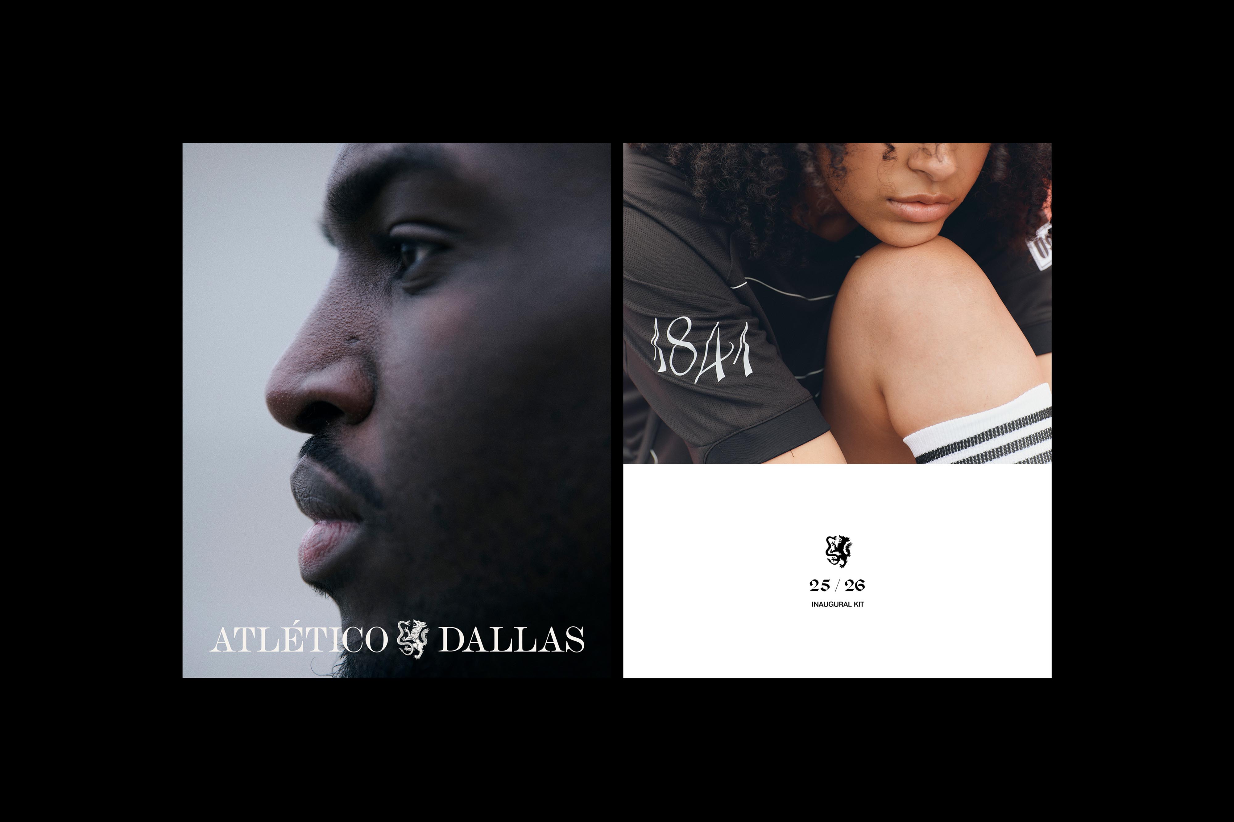
Dallas has always been shaped by people with different visions, united by a shared drive to build something greater. Atlético Dallas carries that same conviction—rooted in values, focused on the long game, and grounded in the community that surrounds it. When naming the club, we looked to a place of tradition and discipline. Atlético—a word universally standing for movement, effort, and athleticism—connects the club to the broader language of world football while affirming its distinctly Texan character, shaped by diversity and its deep connection to Latin America.

The color palette is drawn from the natural elements of Texas itself. Texas Topaz honors the state’s official gemstone and its striking blue hue. Blackland Crude reflects the fertile Blackland Prairie where Dallas was founded, and the oil-rich legacy that shaped the region. Silver Ore nods to the mineral wealth that fueled early settlements across the state. Together, the palette is elemental and enduring—a reflection of the land and its history.
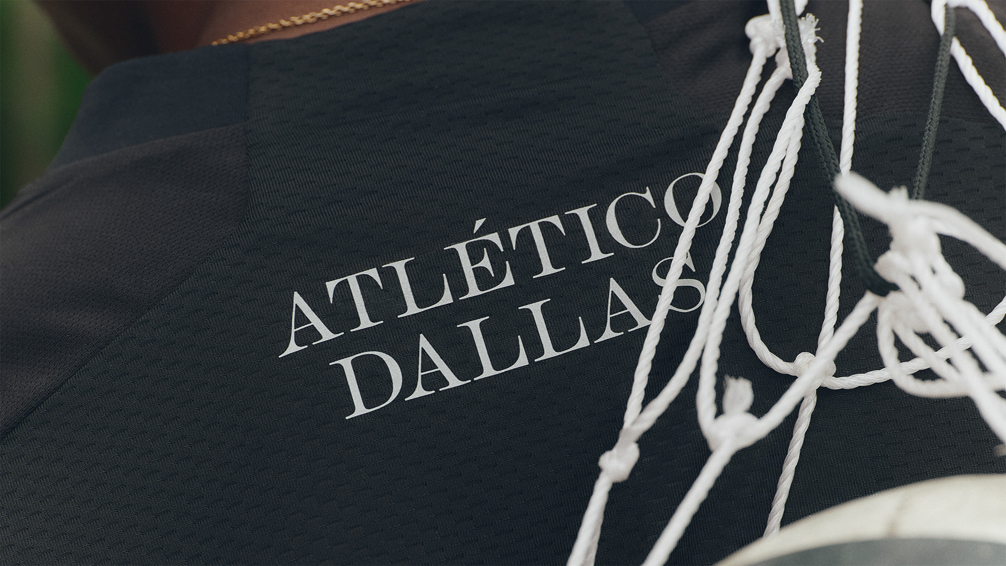
The typography draws inspiration from hand-rendered Spanish-era documents created when Texas and Mexico were one territory. Custom numerals reference the blackletter forms seen across Mexican and Texan graffiti culture, giving the identity a distinctive edge for key moments—scores, dates, and player numbers.

From the prairies and creekbeds that inspired its legend to the city that embodies its drive, Atlético Dallas is a tribute to the builders, the believers, and the ones unafraid to start from nothing.
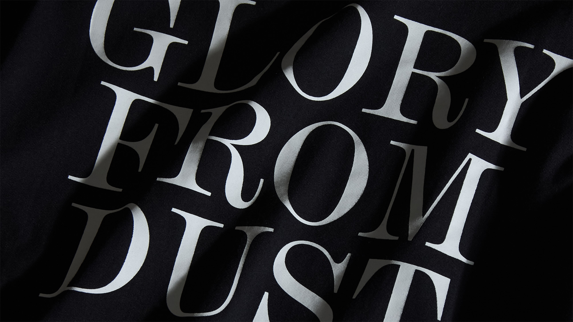
Atlético Dallas—Glory From Dust.


Atlético Dallas
Brand Development
Strategy
Visual Identity
Art Direction
Motion


